GEM Rivals
-
A modern strategy card game centered on collectible gems with unique powers, designed to be easy to pick up yet rewarding to master. Created as a freelance collaboration with a close friend, the project balances striking visuals and clean systems to stand out in a crowded market while appealing to players across experience levels.
Role: Concept, illustration, system design, layout, prepress
Status: Ongoing (playtested + pitched; packaging/marketing phase upcoming)
Audience: Casual players through dedicated strategy fans -
The challenge was to craft a card set that could compete in the saturated strategy market while remaining clear in play:
Distinct yet cohesive when dozens of cards are face-up on the table
Detailed rules requiring immediate legibility and differentiation
A visual identity that is playful, bold, and modern, without feeling juvenile
-
A cartoon-inspired but elevated illustration style, paired with a restrained typographic system, creates a balance of accessibility and sophistication. The result is a deck that’s visually exciting but designed to look just as good on a coffee table during an evening with friends as it does in a competitive play session.
-
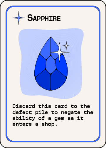
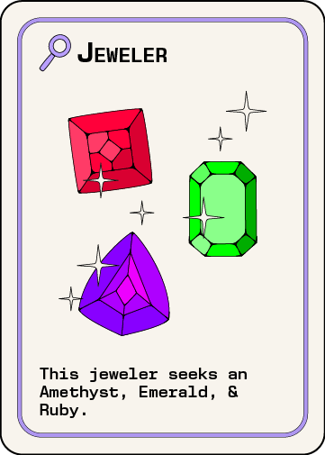
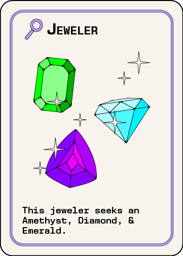
Card Fronts: full set of gem cards with unique powers and tiers
Card Backs: purple palette split by deck: a darker shade for the Gem Deck (primary) and a lighter, desaturated variation for the Jeweler Deck (smaller, ~9 cards). The contrast improves gameplay flow and organization
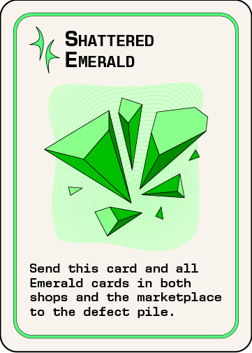
Variations: special shattered gem cards designed in a stylized 3D cartoon , adding rarity and visual drama
Objective Cards: quick-reference cards that guide players through different modes and goals
Design System: established grid, icon set, export presets, and consistent typographic hierarchy
Next Phases: packaging, rule sheets, digital/physical mockups, and promotional assets to support launch.
-
Playtested & Pitched: the digital artwork has been used successfully in playtests and early pitch conversations
Mockups Pending: realistic renders and physical prototypes are next, to support publisher discussions and potential direct-to-consumer sales
Production Ready: artwork is formatted with print-ready specs (CMYK, bleed/safe zones, 300 dpi), making the deck prepared for manufacturing when production begins
-
Typography:
Titles: New Science Mono: bold, small caps, delivering a crisp, contemporary edge
Body: New Science Mono — semi-bold for rules and supporting text, focused on readability
Color Strategy:
Gem Palette: vibrant, high-saturation jewel tones that feel youthful and energetic, but with a polished, modern execution
Backgrounds: Clean off-white fields allow the gem illustrations to dominate without visual clutter
Type: Solid black for maximum readability and contrast
Deck Backs: Dark purple (Gem Deck) and a lighter, desaturated purple (Jeweler Deck) for instant recognition and smoother gameplay organization
Outcome: A visual identity that is bold, functional, and coffee-table worthy: a deck you’d want on display as much as in play
-
Early Explorations: Initial drafts featured colored backgrounds, but shifting to off-white created a more modern, cohesive look where the gems themselves could take center stage
Shattered Variants: Special 3D-rendered gems (one per deck) provide standout moments, contrasting against the otherwise 2D suite while still retaining cartoon-like outlines
Iterations: Multiple rounds of color testing, line refinements, and type alignment ensured the designer and client were both satisfied with the final result
Systemization: Developed a consistent grid and layout logic so that each card feels distinct yet instantly part of a unified family
Result: A refined, modern deck that balances playfulness with clarity, positioned to compete in today’s strategy card market